Virtual Gallery is a global app that allows people to visit museums and galleries on a mobile device. We deliver quickly and conveniently selected exhibitions from the most prominent cultural centers worldwide with detailed 3D tours at any time and place. awards
them for a well-made effort. Our typical user is 12-17 years students interested in art or developing their creative thinking.
My role
UX designer designing an app for Virtual Gallery from conception to delivery.
Responsibilities
Conducting interviews, paper and digital wireframing, low and high-fidelity prototyping, conducting usability studies, accounting for accessibility, and iterating on designs.
The goal
Design an app for a virtual gallery tour that allows users to participate in worldwide exhibitions in the relaxed atmosphere of your home
the problem
Participation in culture for everyone without the expenses of travel and accommodation.
Understanding the user
USER RESearch
personas
problem statments
User journey Maps
Step 2
User research: summary
I conducted interviews and created empathy maps to understand the users I’m designing for and their needs. A primary user group identified through research was working adults who live in small towns, cities, or abroad interested in art.
This user group confirmed initial assumptions about Virtual Gallery customers, but research also revealed that the cost of traveling was not the only factor limiting users from visiting galleries. Other user problems included disabilities like visual impairment or lack of time to visit exhibitions in person.
This user group confirmed initial assumptions about using apps to bust their creativity. Still, research also revealed that access to the application should be free to allow all users to download and use it without any limitations.
We found out that users are interested in some awards for doing a creative task, and we focused on it.
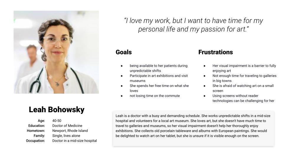
Personas
Problem statement:
Leah is a busy doctor of medicine in a middle-age who needs an app dedicated to her visual impairment because she wants to participate in art exhibitions
Problem statement:
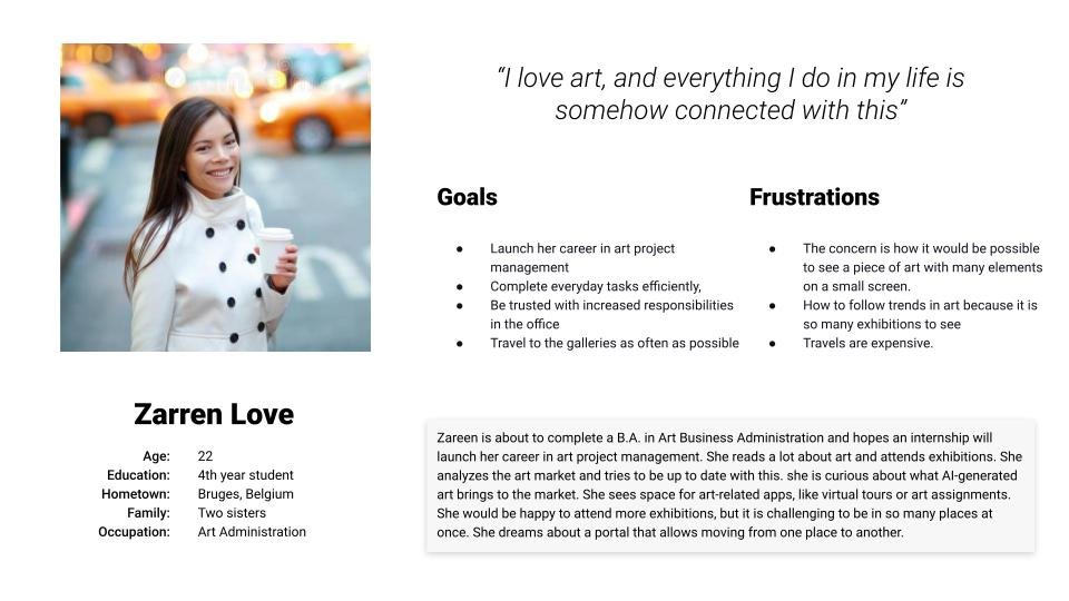
Zareen is about to complete a B.A. in Art Business Administration and hopes an internship will launch her career in art project management. She reads a lot about art and attends exhibitions. She analyzes the art market and tries to be up to date with this. she is curious about what AI-generated art brings to the market. She sees space for art-related apps, like virtual tours or art assignments. She would be happy to attend more exhibitions, but it is challenging to be in so many places at once. She dreams about a portal that allows moving from one place to another.
Step 2
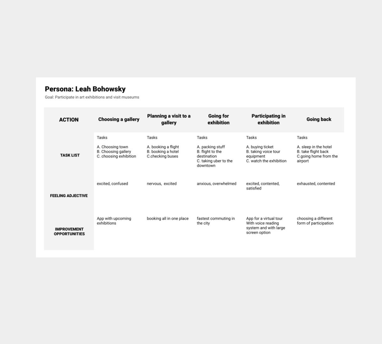
User journey map
Mapping Leah user journey revealed how helpful it would be for users to have a dedicated Virtual Galleries app for participating in exhibitions.
Starting the design
Paper wireframes
Digital wireframes
Low-fidelity prototype
Usability studies
step 1
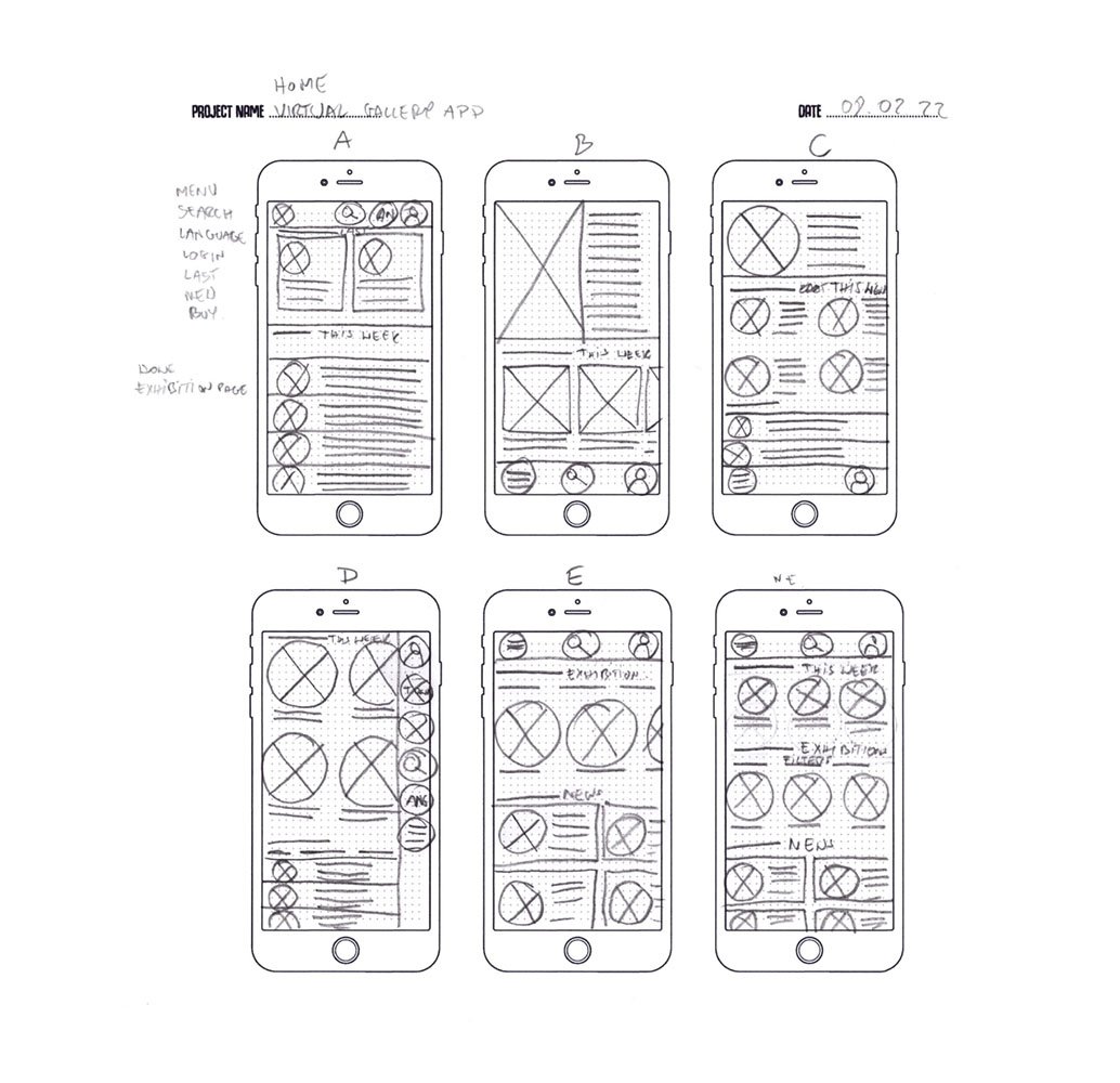
Paper wireframes
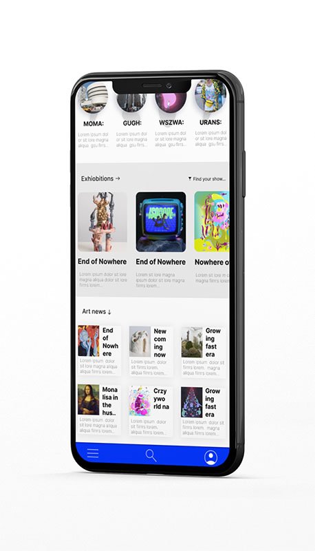
Taking the time to draft iterations of each app’s screen on paper ensured that the elements that made it to digital wireframes would be well-suited to address user pain points. I prioritized quick and easy access from the home screen to find exhibitions and art news users could be interested in.
Step 2
Digital wireframes
As the initial design phase continued, I made sure to base screen designs on feedback and findings from the user research.
Step 2
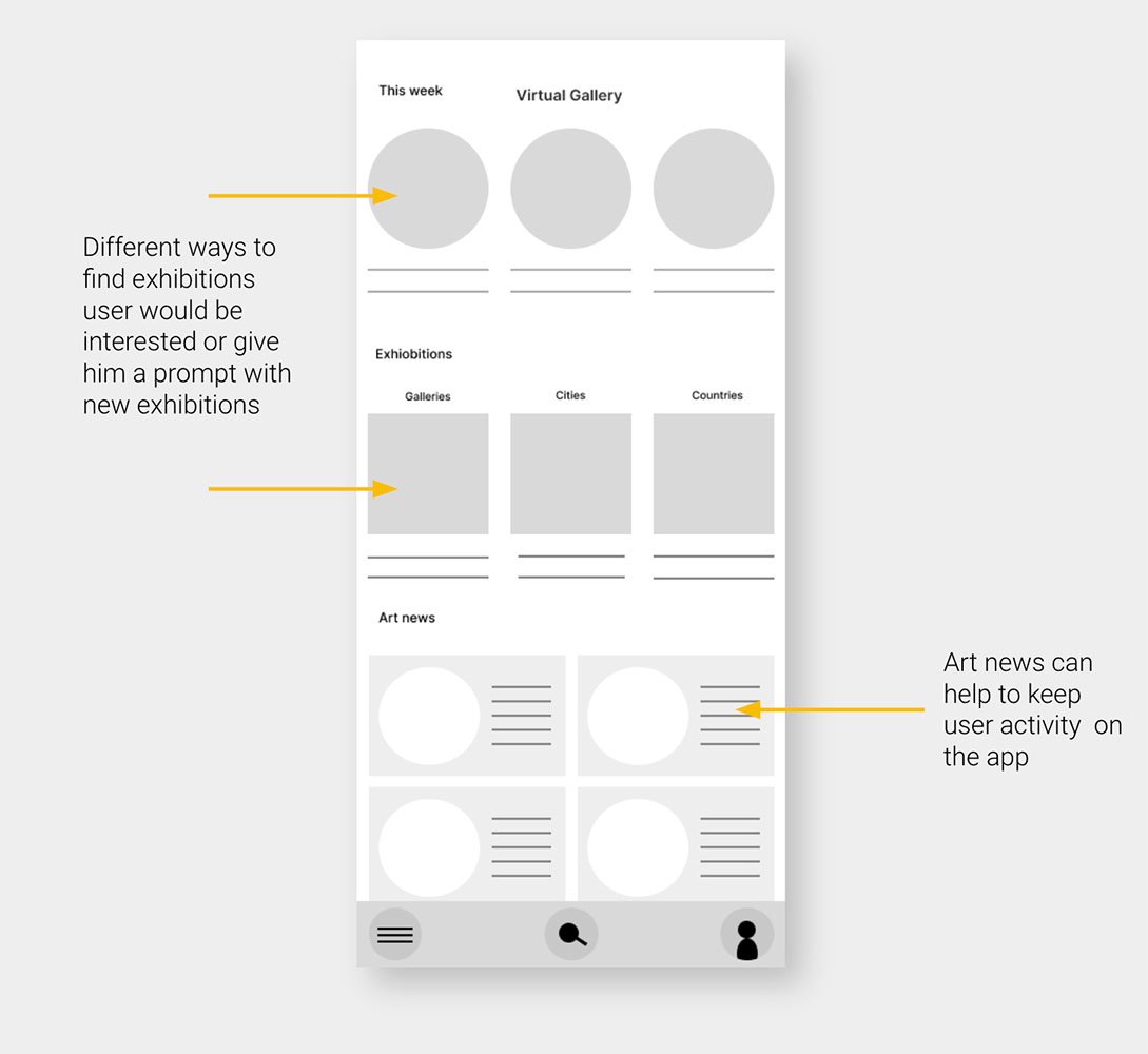
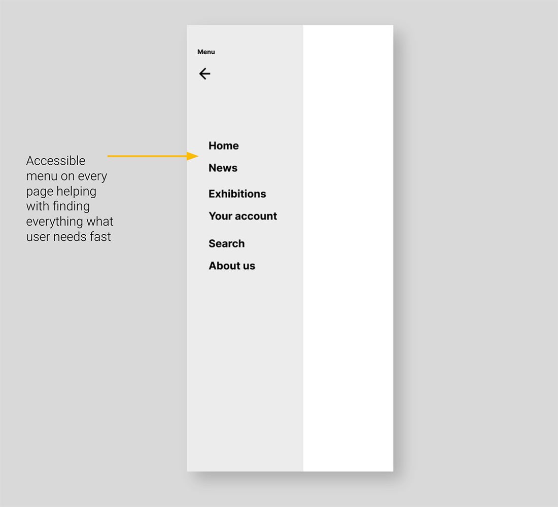
Digital wireframes
Easy navigation was a key user need to address in the designs in addition to equipping the app to work with assistive technologies.
Step 2
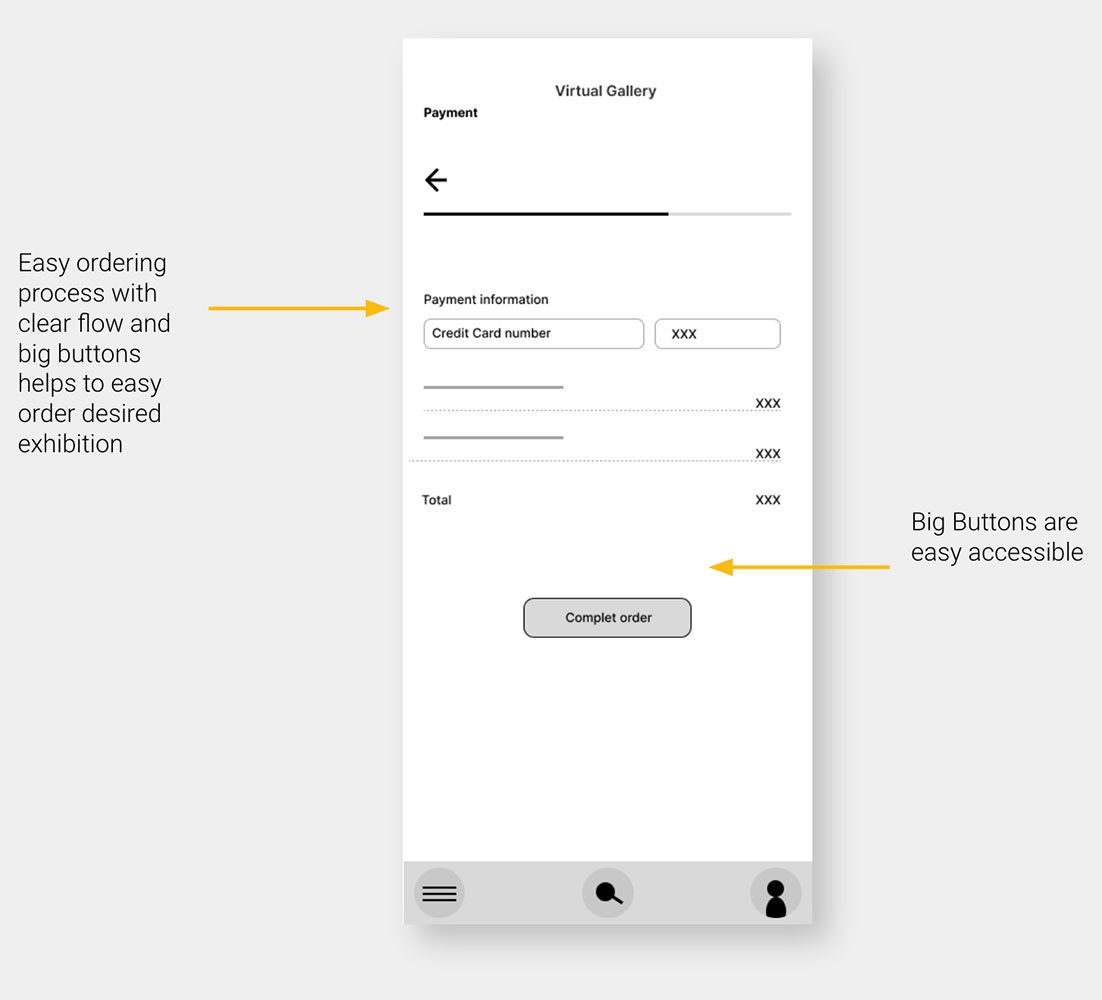
Digital wireframes
Easy ordering process with clear flow and big buttons helps to easy order desired exhibition
Step 4
Low-fidelity prototype
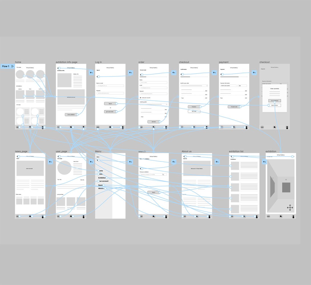
Using the completed set of digital wireframes, I created a low-fidelity prototype. The primary user flow I connected was fainting an exhibition and ordering it, so the prototype could be used in a usability study.
Usability study: parameters and findings
Study type:
Unmoderated usability study
Location:
United States, remote
Participants
5 participants
Length:
20-30 minutes
Usability study findings
I conducted two rounds of usability studies. Findings from the first study helped guide the designs from wireframes to mockups. The second study used a high-fidelity prototype and revealed what aspects of the mockups needed refining.
Round 1 findings
1
Users want to visit exhibitions without extra costs
2
Users wish to have a voice guide
3
Users want information about upcoming exhibitions
Round 2 findings
1
Participants had trouble with filters
2
Some texts on buttons have confusing action
3
Users would like to vote for added answers
Refining the design
Mockups
High-fidelity prototype
Accessibility
Step 1
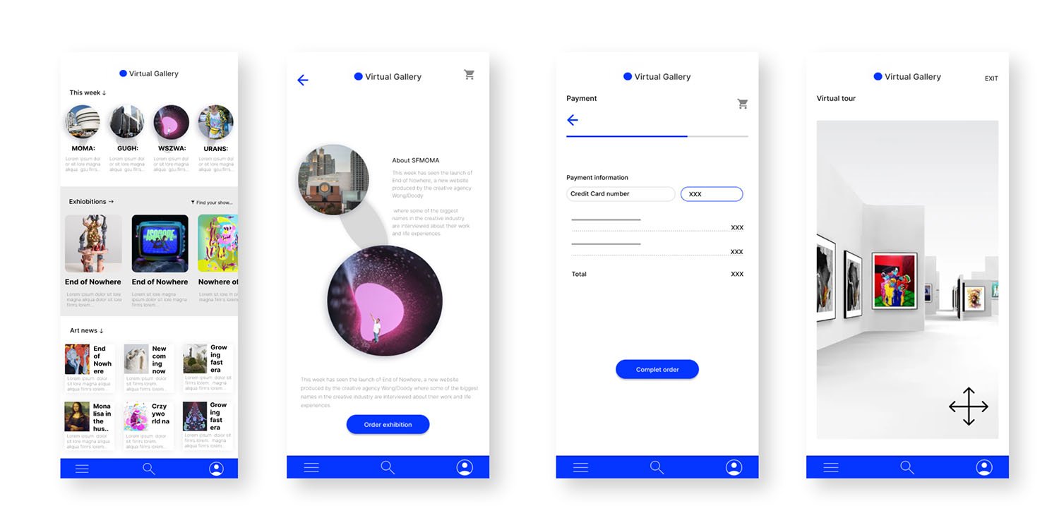
Mockups
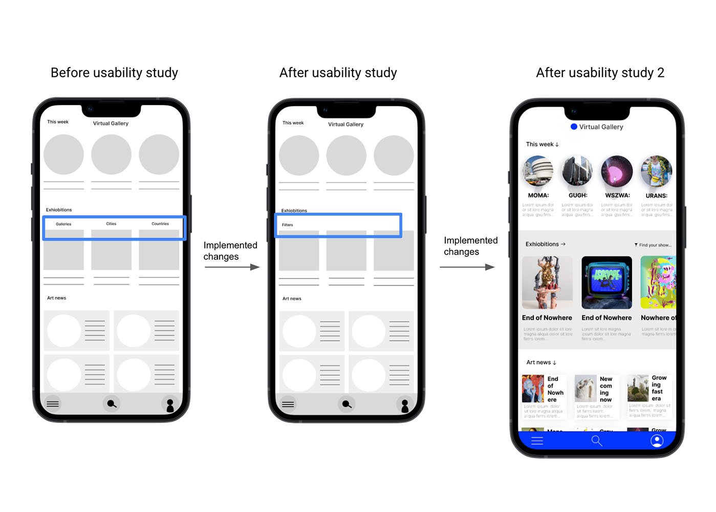
Early designs allowed for some customization, but after the usability studies, I changed the way of searching exhibitions because it was not immediately clear how to use filters the find the show. After 2 round of usability study, I simplified it one more time
Our about
Mockups
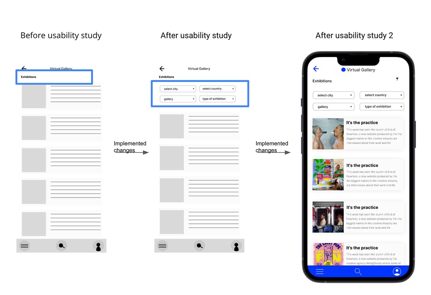
Early designs allowed for some customization, but after the usability studies, I changed the way of selecting exhibitions by filters on exhibitions page. After 2 round of usability study, I simplified it one more time
Our about
Mockups
Our about
High-fidelity
prototype
I included consideration for additional screen sizes in my mockups based on my earlier wireframes. Because users can use website in many different situations, I felt it was essential to optimize the browsing experience for a range of device sizes, such as mobile and tablet, so users have the smoothest experience possible.
Accessibility considerations
1
Provided access
to users who are vision impaired through adding alt text to images for screen readers.
2
Used icons to
help make
navigation easier.
3
Check the colors in the app if they are compatible with a color accessibility guideline
Going forward
Nextsteps
1
Conduct another round of usability studies to validate whether the pain points users experienced have been effectively addressed.
2
Check how people prefer to pay for exhibitions, once, monthly, or annually subscription, etc
3
Think over the best way for internalizing the app, cheek if people are interested in watching exhibitions only in their countries or globally
Takeaways
What users think
The app makes users feel like Virtual Gallery really thinks about how to meet their needs.
One quote from peer feedback:
"The app made it so easy to see an exhibition in New York from my coach in Oslo without traveling and all the expenses. It's amazing! It's so comfortable, and I will use it very often!"
What I learned:
While designing the Virtual Gallery app, I learned that the first ideas for the app were only the beginning of the process. Usability studies and peer feedback influenced each iteration of the app’s designs and helped to achieve the goal for the users and us as a company.