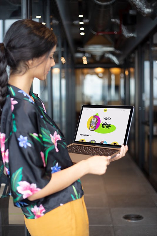
T-BE is an online t-shirt shop that allows people to buy t-shirts from the best artists in a more personalized way. Our goal is to deliver more options for trying on clothes online. Our typical user is between 20-30 and works in the creative industry or does extreme sports.
My role
UX designer designing an app for T-BE t-shirt shop from conception to delivery.
Responsibilities:
Conducting interviews, paper and digital wireframing, low and high-fidelity prototyping, conducting usability studies, accounting for accessibility, and iterating on designs.
The goal
Design a user-friendly shop with the best artists and a new modern way to try on clothes online in an environment they like.
the problem
Most T-shirts shops have too many T-shirts design and to less recognizable artists. Most of them need more convenient options to try on clothes online.
Understanding the user
USER RESearch
personas
problem statments
User journey Maps
Step 2
User research: summary
I conducted interviews and created empathy maps to understand the users I am designing for and their needs. A primary user group identified through research was working creative industry adults who live in big cities and are interested in art.
This user group confirmed initial assumptions about new T-shirt shop customers, but research also revealed that access to new designs by famous artists is not the only factor users are interested in. We find out that users are interested in more advanced options to try-on clothes online to feel more like they are in a real shop.
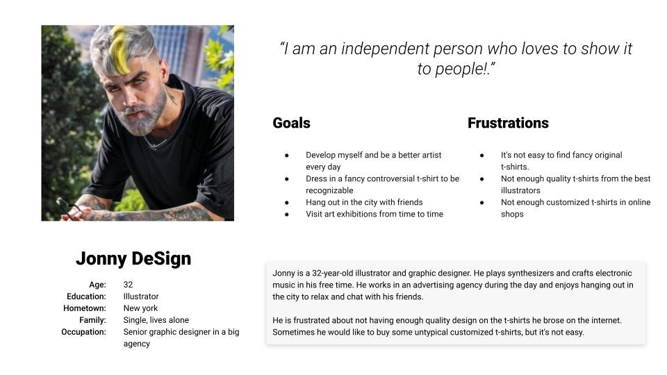
Personas
Problem statement:
Jonny is an illustrator and graphic designer working in an agency that needs a selection of great t-shirts designed by the best artists because he loves to show up in a new, good-looking, and controversial outfit to show his personality.
Problem statement:
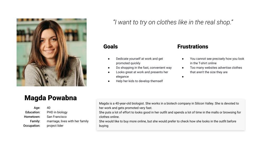
Magda is a 40-year-old biologist. She works in a biotech company in Silicon Valley. She is devoted to her work and gets promoted very fast.
She puts a lot of effort to looks good in her outfit and spends a lot of time in the malls or browsing for clothes online.
She would like to buy more online, but she would prefer to check how she looks in the outfit before buying
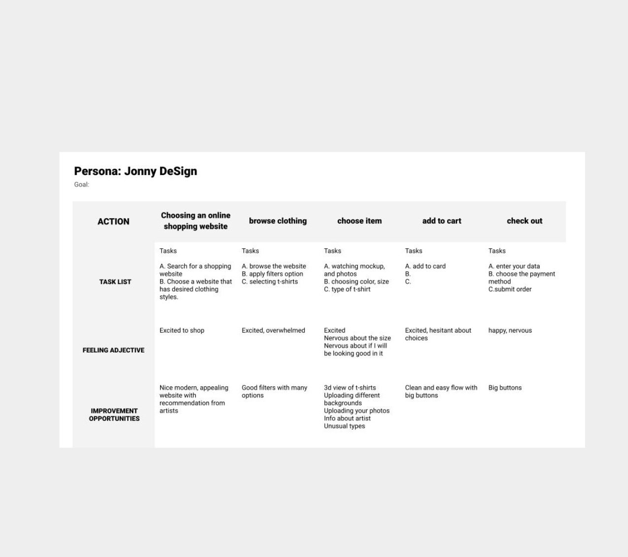
StEP 2
User journey map
Jonny is an illustrator and graphic designer working in an agency that needs a selection of great t-shirts designed by the best artists because he loves to show up in a new, good-looking, and controversial outfit to show his personality.
Starting the design
Paper wireframes
Digital wireframes
Low-fidelity prototype
Usability studies
step 1
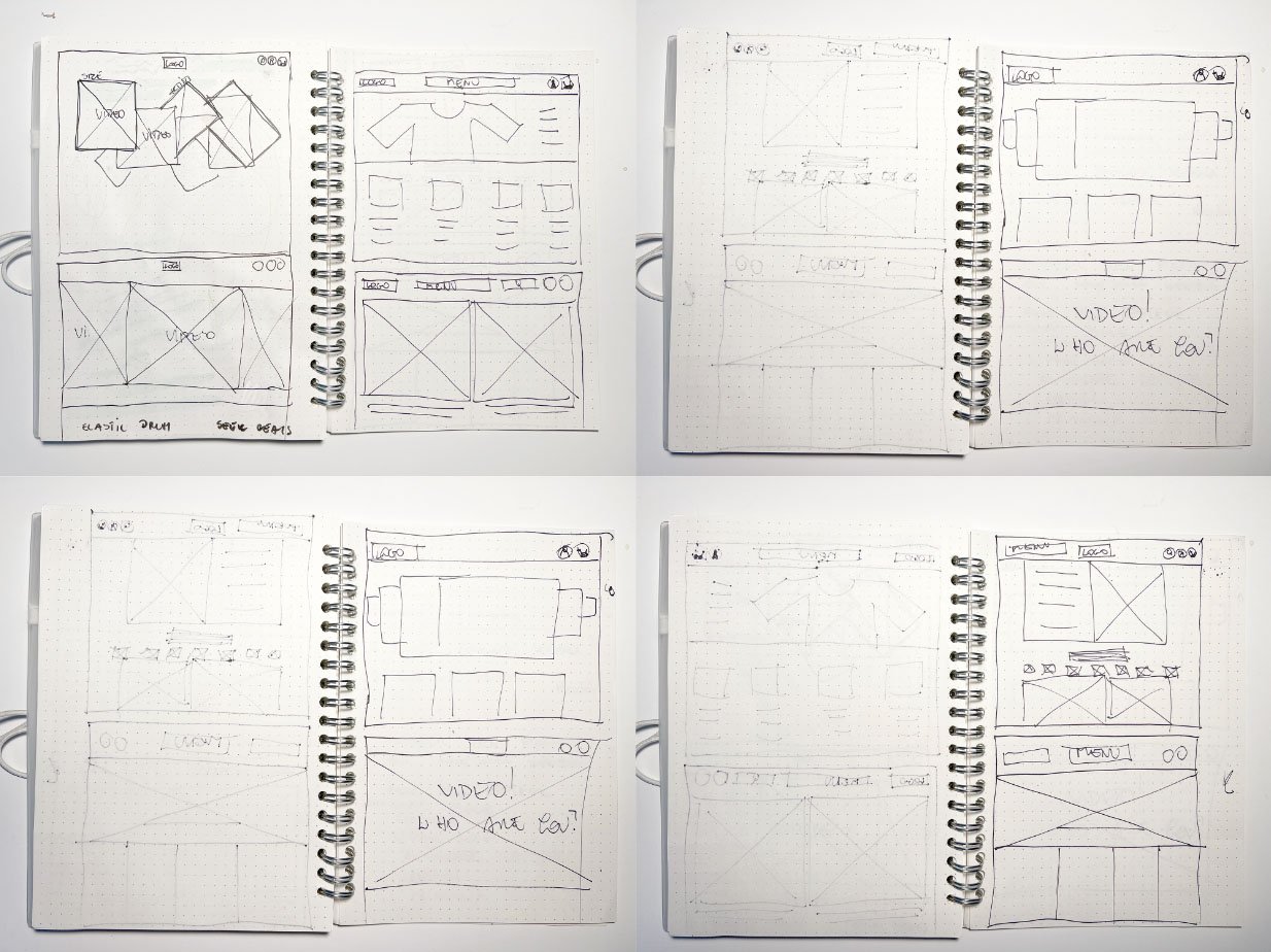
Paper wireframes
Taking the time to draft iterations of each website screen on paper ensured that the elements that made it to digital wireframes would be well-suited to address user pain points. I prioritized a clean and minimalist home screen to design a modern look and easy navigation.
Step 2
Digital wireframes
As the initial design phase continued,
I made sure to base screen designs on feedback and findings from the user research.
StEP 3
Screen wireframe
size variation(s)
Step 4
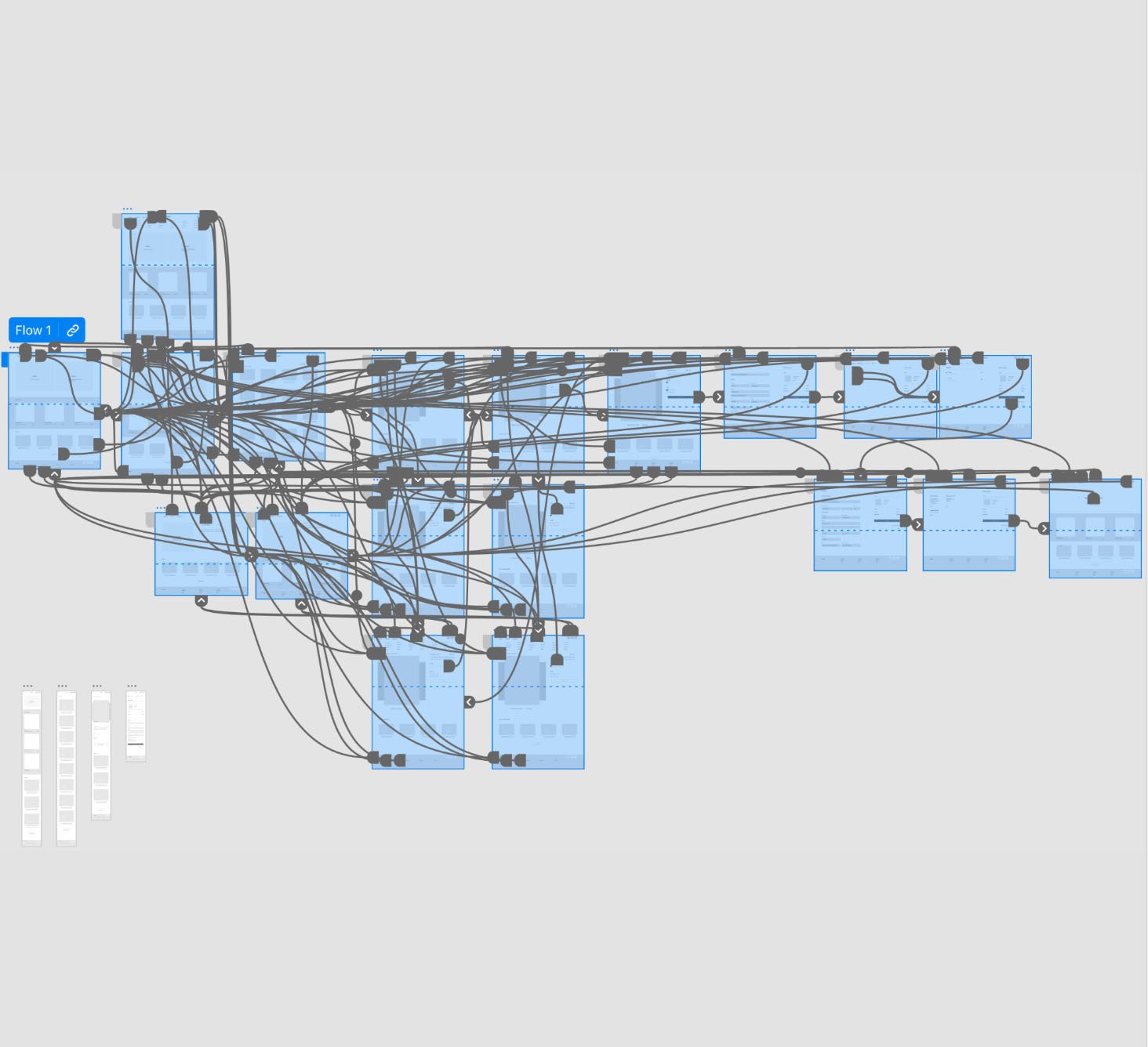
Low-fidelity prototype
To create a low-fidelity prototype, I connected all of the screens involved in the primary user flow of adding an item to the cart and checking so the prototype could be used in a usability study as an example of a working website.
Usability study: parameters and findings
Study type:
Unmoderated usability study
Location:
United States, remote
Participants
5 participants
Length:
20-30 minutes
Usability study findings
I conducted two rounds of usability studies. Findings from the first study helped guide the designs from wireframes to mockups.
The second study used a high-fidelity prototype and revealed what aspects of the mockups needed refining.
Round 1 findings
1
Users want to visit exhibitions without extra costs
2
Users wish to have a voice guide
3
Users want information about upcoming exhibitions
Round 2 findings
1
Participants had trouble with filters
2
Participants had trouble with finding the exhibition
3
The checkout process has too many unnecessary steps
Refining the design
Mockups
High-fidelity prototype
Accessibility
Step 1
Mockups
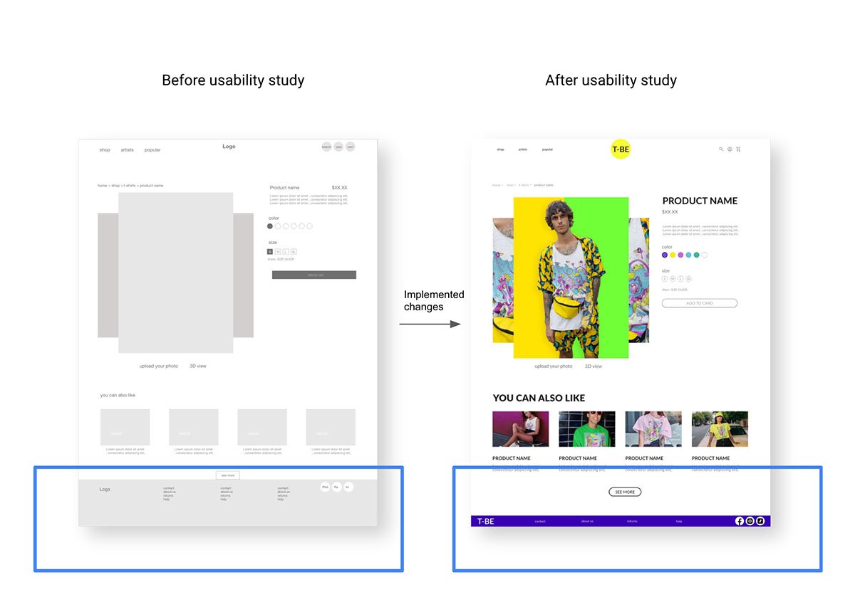
Early designs allowed for some customization, but after the usability studies, I simplified the footer menu and removed some options to make it less complicated
Our about
Mockups
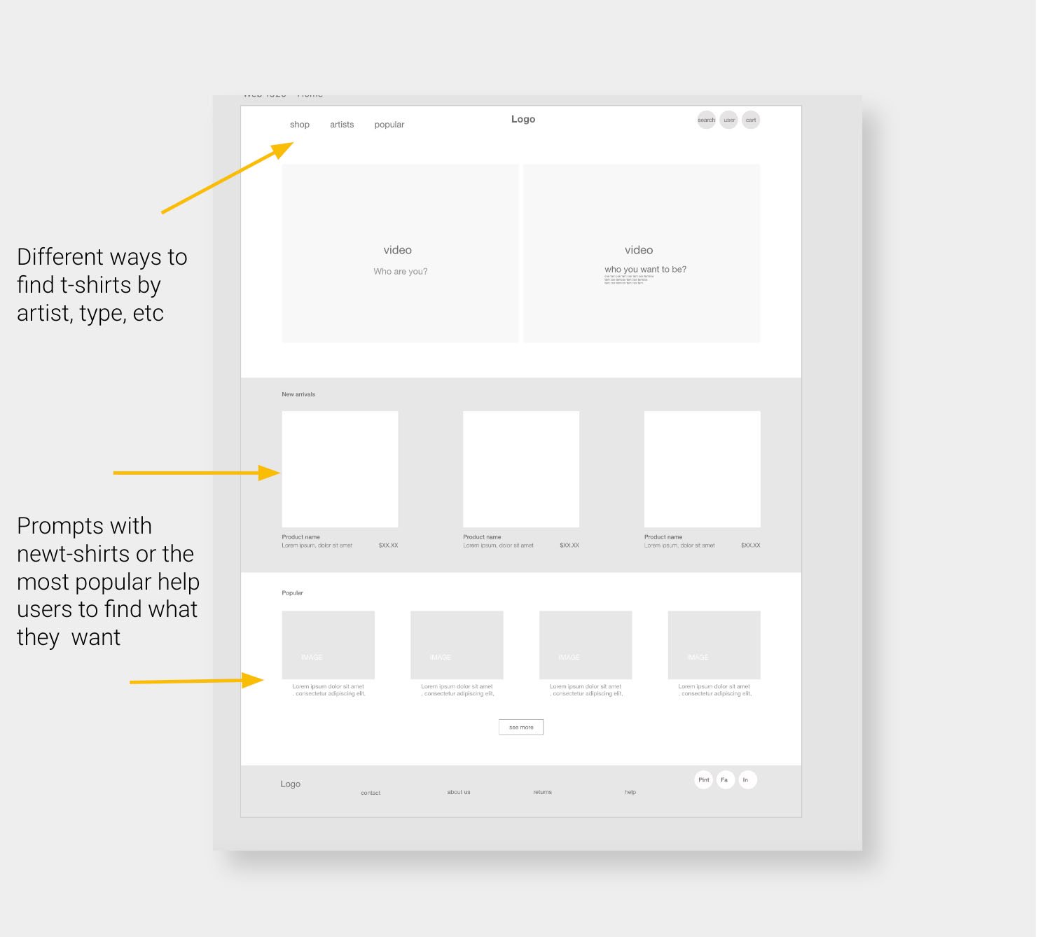
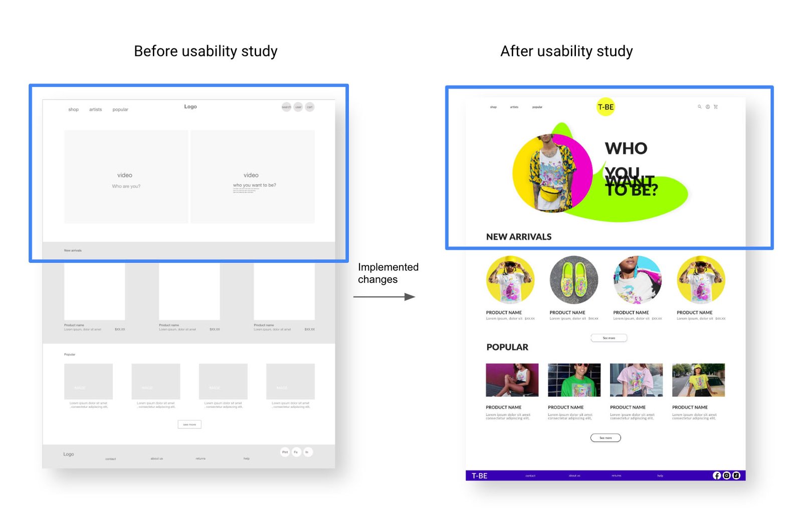
Early designs allowed for some customization, but after the usability studies, I resigned from adding two videos as hero images and designed the simplest images with large typography
Our about
Mockups
Our about
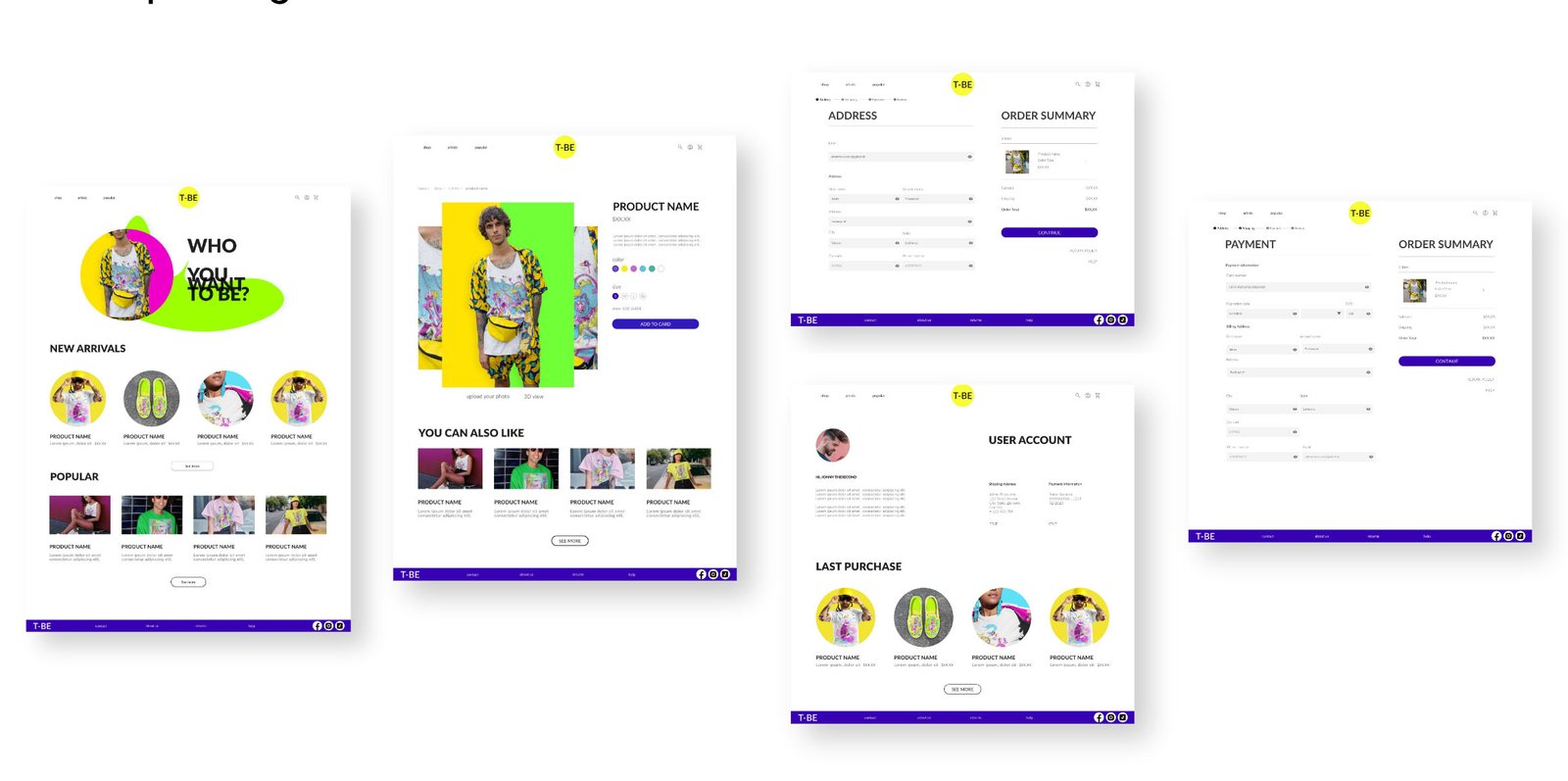
Mockups:
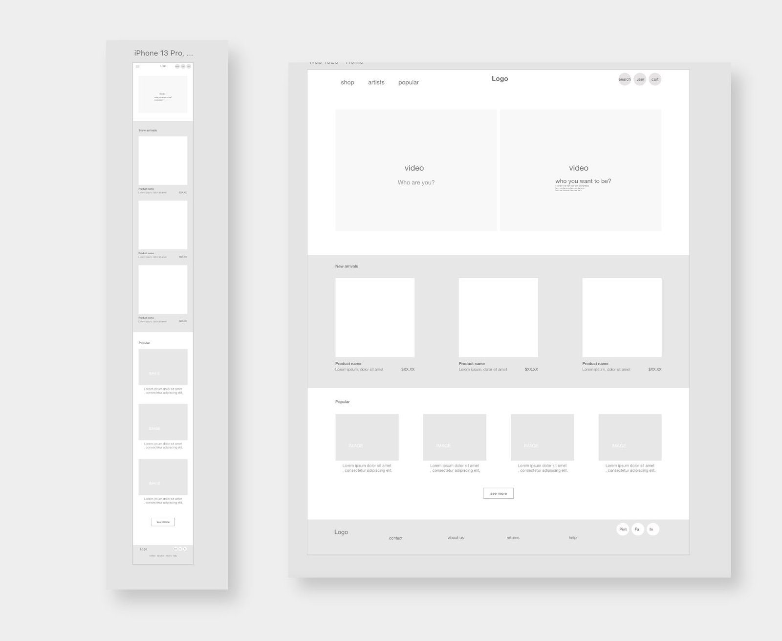
screen size variations
I included consideration for additional screen sizes in my mockups based on my earlier wireframes.
Because users shop from various devices, I felt it was essential to optimize the browsing experience for a range of device sizes, such as mobile and tablet, so users have the smoothest experience possible.
Our about
High-fidelity
prototype
Accessibility considerations
1
I used headings with different sized text for clear visual hierarchy
2
I used landmarks to help users navigate the site, including users who rely on assistive technologies
3
Check the colors in the app if they are compatible with a color accessibility guideline
Going forward
Nextsteps
1
Conduct another round of usability studies to validate whether the pain points users experienced have been effectively addressed.
2
Check more options for payments.
3
Think over the best way for internalizing the app, cheek if people are interested in using other languages and which.
Takeaways
What users think
The app makes users feel like our T-Shirt shop really thinks about how to meet their needs.
One quote from peer feedback:
"The app made it easy to find a beautiful t-shirt without spending hours!"
What I learned:
While designing the T-BE T-Shirt shop, I learned that the first ideas for the web were only the beginning of the process.
Usability studies and peer feedback influenced each iteration of the app’s designs and helped to achieve the goal for the users and us as a company.